grid 网格布局与 flex 弹性盒子布局一样,都需要控制 容器 跟 子元素 的样式才能做出想要的效果,部分场景只控制 容器 样式也行。
grid 样式属性
一大堆 属性 来袭~~
与网格相关的 CSS 属性有一大堆,毕竟要同时控制行和列(行、列也被称为 网格轨道 grid track)。
容器(父元素)相关的 CSS 属性
display: grid 设置容器为网格布局。
grid-template-columns 设置列宽(可固定、百分比、fr 单位或函数)。
grid-template-rows 设置行高。
grid-template-areas 通过命名区域定义布局结构。
grid-template 简写属性: grid-template-rows 、 grid-template-columns 与 grid-template-areas。
column-gap 设置列间距。
row-gap 设置行间距。
gap 简写属性:column-gap、row-gap。
grid-auto-columns 设置隐式创建(超出定义列)的列宽。
grid-auto-rows 设置隐式创建(超出定义行)的行高。
grid-auto-flow 控制自动放置子元素的流向。
grid 简写属性,可同时设置显式网格属性 grid-template-rows 、 grid-template-columns 和 grid-template-areas,隐式网格属性 grid-auto-rows 、 grid-auto-columns 和 grid-auto-flow。
justify-items 控制所有子元素在 行方向 的对齐方式(默认 stretch)。
align-items 控制所有子元素在 列方向 的对齐方式(默认 stretch)。
justify-content 当网格总宽度小于容器时,控制整体水平对齐。
align-content 当网格总高度小于容器时,控制整体垂直对齐。
子元素相关的 CSS 属性
grid-column 设置子元素占据的列范围(简写属性)。
grid-row 设置子元素占据的行范围。
grid-area 指定子元素属于哪个命名区域或简写位置。
justify-self 覆盖容器的 justify-items,控制单个子元素的行对齐。
align-self 覆盖容器的 align-items,控制单个子元素的列对齐。
order 调整子元素的显示顺序(类似 Flexbox)。
z-index 控制子元素的层叠顺序。
grid 相关的函数/单位
fr 剩余空间分配单位(类似 Flexbox 的 flex-grow)。
repeat() 重复设置轨道(行/列)。
minmax() 设置轨道(行/列)尺寸范围。
fit-content() 将给定大小夹紧为可用大小。
auto-fit/auto-fill 自动填充轨道(响应式布局常用)。
第一式:容器
本文中的默认代码,所有 grid 属性都是在此基础上增加:display: grid 让容器变身为网格布局
与 flex 一样,网格布局也是从 display 开始, display 作用就是控制元素显示方式,使用率位居第二。显示效果:
注意第二个盒子看红色虚线,这个是 Chrome 浏览器的辅助显示 grid 网格线,就是 display: grid 将盒子分为了网格。
控制网格行/列大小
默认情况网格的行和列都是 auto,即自动分配容器空间。
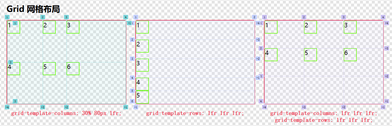
grid-template-columns 设置列的大小。
grid-template-rows 设置行的大小。
使用固定像素值:- .box {
- grid-template-columns: 130px 130px 130px;
- grid-template-rows: 80px 80px 80px;
- }
fr 单位:
fr 表示空间等份,fr 的值是相对于容器的可用空间计算得出,可食用浮点数值,比如 0.5fr。- .box {
- grid-template-columns: 1fr 1fr 1fr;
- grid-template-rows: 1fr 1fr 1fr;
- }
- .box {
- grid-template-columns: 20% 80px 1fr;
- }
除了以上使用的单位,其他 CSS 的单位也支持,比如百分比、em、vw 等,单位也可以混着使用,比如下图第一项:
使用 repeat() 函数
如果有 10 列等分的子元素,是不是要写 10 个 1fr ?
懒惰使科学进步,重复工作交给 repeat() 函数,如下:- grid-template-columns: repeat(3, 1fr); /* 表示 3 列等分 */
- grid-template-columns: repeat(20, 1fr); /* 表示 20 列等分 */
- grid-template-columns: 50px repeat(4, 1fr) 50px; /* 表示第一列 50px 接着重复 4 个等分的列,最后再跟一个 50px 列 */
- grid-template-columns: repeat(2, 50px 1fr) 100px; /* 表示重复 2 次 50px 1fr ,最后一个列 100px */
repeat()关键字:
auto 与 1fr 等效,表示等分空间。
auto-fill 有剩余空间会使用空行/列占位。
auto-fit 有剩余空间会拉伸现有行/列填充空间。
max-content 列宽由单元格内最长文本决定。
min-content 列宽由内容最小宽度决定。
使用方式如下:- grid-template-columns: repeat(3, auto); /* 效果与 repeat(3, 1fr) 相同 */
- grid-template-columns: repeat(auto-fill, minmax(100px, 1fr)); /* 自动填充列,每列最小 100px,最大 1fr */
- grid-template-columns: repeat(auto-fit, minmax(100px, 1fr)); /* 自动适应列,每列最小 100px,最大 1fr */
- grid-template-columns: repeat(3, max-content); /* 列宽由单元格内最长文本决定 */
- grid-template-columns: repeat(3, min-content); /* 列宽由内容最小宽度决定 */
max-content 与 min-content 差异: max-content 会尽可能用多的把内容放下(尽量放在一行中),min-content 会用尽可能少的空间存放内容。
效果如下:
注意:本例中取消了子元素的宽高设置。
使用 minmax() 函数
此函数包含两个参数,最小值 和 最大值,一般用于响应式布局,控制子元素最大宽度和最小宽度,使用方法参考上图。
此函数也可以单独使用,比如:- grid-template-columns: minmax(20px, auto) 1fr 1fr;
计算规则:min(最大尺寸, max(最小尺寸, argument))
首先用传入的 参数 与子元素的 最小尺寸 比较,取两者 最大值;
再用比价出的 最大值 与子元素的 最大尺寸 比较,取 最小值。- grid-template-columns: fit-content(80px) 1fr; /* 第1列自适应但不超过80px,第2列占剩余空间 */
- grid-template-columns: repeat(3, fit-content(80px)); /* 第1、2、3列自适应但不超过80px */
grid-template-areas 设置网格区域
此属性的作用就是划地盘,老大(容器盒子)划分网格区域地盘命名,然后马仔(子元素)使用 grid-area 来插旗说某个地盘是谁的。
grid-template-areas 需要结合 grid-area 使用,使用方法如下:- .box {
- display: grid;
- grid-template-areas:
- "A A A"
- "B C C"
- "B D D"; /*区域划分为 三行 三列(A的地盘占了整个第一行,B占了第二行和第三行的第一列,C占了第二行剩余空间,D占了第三行剩余空间)*/
- grid-template-columns: repeat(3, 1fr); /* 指定容器分为 3 等分 */
- grid-template-rows: repeat(3, 1fr); /* 指定容器分为 3 等分 */
- }
- .box .item {
- border: 2px solid rgba(0,255,0,1);
- }
- .box .item:nth-child(1) {
- grid-area: A; /* 第 1 个子元素说它要 A 地盘 */
- }
- .box .item:nth-child(2) {
- grid-area: B; /* 第 2 个子元素说它要 B 地盘 */
- }
- .box .item:nth-child(3) {
- grid-area: C; /* 第 3 个子元素说它要 C 地盘 */
- }
- .box .item:nth-child(4) {
- grid-area: D; /* 第 4 个子元素说它要 D 地盘 */
- }
- .box .item:nth-child(5) { /* 第 1 、5 子元素同时要 A 地盘 */
- grid-area: A;
- padding-left: 30px;
- }
可使用 . 来标记未命名区域,表示这地方是无主的,谁都不能占用,比如:- .box {
- grid-template-areas:
- "a a ."
- "a a ."
- ". b c";
- }
grid-template 简写属性
使用关键字 none:同时设置行/列,需注意必须同时设置两个值,指定一个值是无效的。- grid-template: 100px 1fr / 50px 1fr;
- /* 等价于 */
- grid-template-rows: 100px 1fr;
- grid-template-columns: 50px 1fr;
- grid-template:
- "a a a" 20%
- "b b b" auto;
- /* 等价于 */
- grid-template-rows: 20% auto;
- grid-template-columns: none;
- grid-template-areas:
- "a a a"
- "b b b";
- grid-template:
- "A A A" 1fr
- "B C C" 1fr
- "B D D" 1fr
- / 1fr 1fr 1fr;
- /* 等价于 */
- grid-template-rows: 1fr 1fr 1fr;
- grid-template-columns: 1fr 1fr 1fr;
- grid-template-areas:
- "A A A"
- "B C C"
- "B D D";
- grid-template:
- [header-left] "head head" 30px [header-right]
- [main-left] "nav main" 1fr [main-right]
- [footer-left] "nav foot" 30px [footer-right]
- / 120px 1fr;
使用 column-gap 定义列间距,使用 row-gap 定义行间距,让子元素别离太近,有点边界感:
它俩都可食用所有 CSS 支持的单位~- .box {
- column-gap: 30px;
- row-gap: 20px;
- }
使用 gap 属性合并行列间距,以下代码与上面等效:gap: 20px 只有一个值时,表示行列间距都为 20px。
设置隐式行列大小
什么是隐式行列大小:
grid-template-columns 声明的是显示的列大小,grid-auto-columns 声明的是隐式行列大小。
所谓显示就是明确看得到的列结构,而隐式就是没有明确声明的列大小。
比如:- .box {
- display: grid;
- grid-template-areas: "A A A A";
- grid-template-columns: 40px 1fr 50px; /* 显式 3 列 */
- grid-auto-columns: 100px; /* 隐式列宽 100px */
- }
看下图左右两个容器的最后一个子元素 D 区别:
grid-auto-rows 用法与 grid-auto-columns 一致,都是用于隐式声明。
可使用关键字或函数设置隐式声明:- grid-auto-rows: minmax(100px, auto);
- grid-auto-rows: fit-content(20%);
- grid-auto-rows: min-content max-content auto;
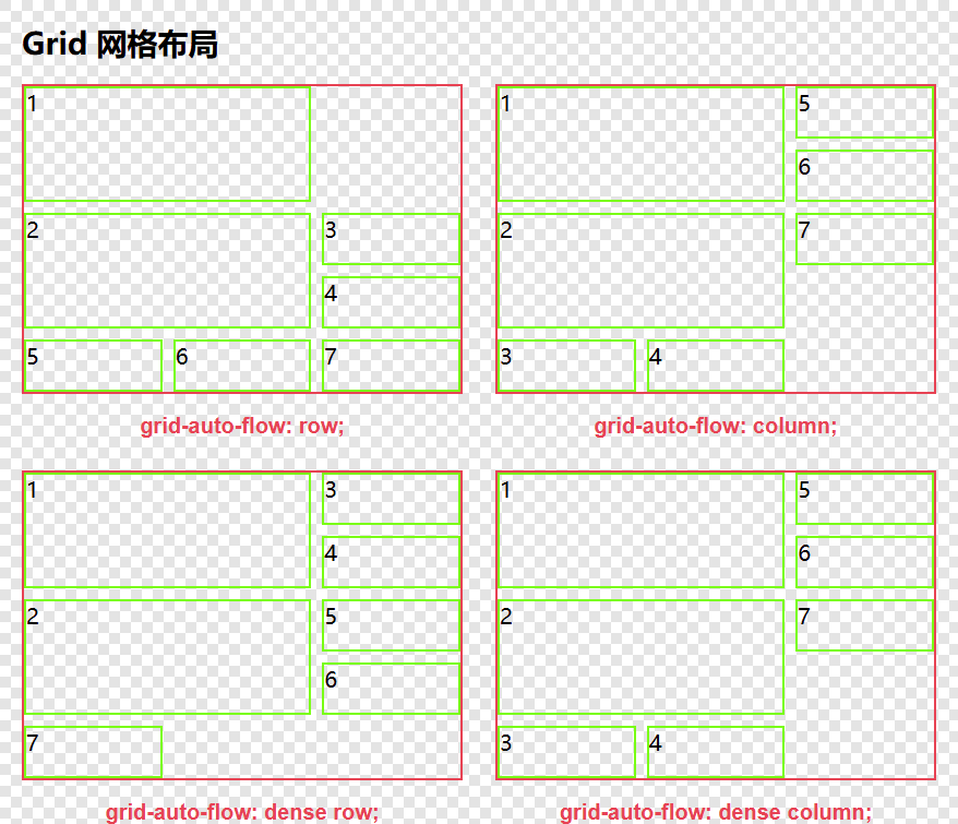
设置子元素的流向
网格布局默认按行排列子元素,可通过 grid-auto-flow 控制自动放置子元素的流向,其值有三个关键字,用法如下:- .box {
- display: grid;
- gap: 10px;
- grid-template-columns: repeat(3, 1fr);
- grid-template-rows: repeat(5, minmax(40px, auto));
- }
- .box:nth-child(1) {
- grid-auto-flow: row;/* 默认行为 */
- }
- .box:nth-child(2) {
- grid-auto-flow: column;/* 按列排列子元素 */
- }
- .box:nth-child(3) {
- grid-auto-flow: dense row;/* 启用“密集填充”模式,尝试填充网格中的空隙 */
- /* grid-auto-flow: dense; 与 grid-auto-flow: dense row; 相同 */
- }
- .box:nth-child(4) {
- grid-auto-flow: dense column;/* 启用“密集填充”模式,尝试填充网格中的空隙 */
- }
-
- .box .item:nth-child(1),
- .box .item:nth-child(2) { /* 控制第一个和第二个子元素宽高都占用 2 行 2 列 */
- grid-column: auto / span 2;
- grid-row: auto / span 2;
- }
简写属性 grid
用于组合 grid-template-rows、grid-template-columns、grid-template-areas、grid-auto-rows、grid-auto-columns 和 grid-auto-flow。
grid 简写最多覆盖三个属性,无法同时覆盖六个属性!!!
grid 属性值语法规则:- /* <'grid-template'> values */
- /* <'grid-template-rows'> /
- [ auto-flow && dense? ] <'grid-auto-columns'>? values */
- /* [ auto-flow && dense? ] <'grid-auto-rows'>? /
- <'grid-template-columns'> values */
- grid: none; /* 不设置任何属性 */
- grid: "a" 100px "b" 1fr;
- /* 等价于 */
- grid-template-rows: 100px 1fr;
- grid-template-areas:
- "a"
- "b";
- grid: [line-name1] "a" 100px [line-name2];
- /* 等价于 */
- grid-template-rows: [line-name1] 100px [line-name2];
- grid-template-areas: "a";
- grid: "a" 200px "b" min-content;
- /* 等价于 */
- grid-template-rows: 200px min-content;
- grid-template-areas:
- "a"
- "b";
- grid: 100px / 200px;
- /* 等价于 */
- grid-template-rows: 100px;
- grid-template-columns: 200px;
- grid: 200px / auto-flow;
- /* 等价于 */
- grid-template-rows: 200px;
- grid-auto-flow: column;
- grid: 30% / auto-flow dense;
- /* 等价于 */
- grid-template-rows: 30%;
- grid-auto-flow: column dense;
- grid: repeat(3, [line1 line2 line3] 200px) / auto-flow 300px;
- /* 等价于 */
- grid-template-rows: repeat(3, [line1 line2 line3] 200px);
- grid-auto-flow: column;
- grid-auto-columns: 300px;
- grid: auto-flow / 200px;
- /* 等价于 */
- grid-auto-flow: row;
- grid-template-columns: 200px;
- grid: auto-flow dense / 30%;
- /* 等价于 */
- grid-auto-flow: dense; /* 等同于 grid-auto-flow: dense row; */
- grid-template-columns: 30%;
- grid: auto-flow dense 40% / [line1] minmax(20em, max-content);
- /* 等价于 */
- grid-template-columns: [line1] minmax(20em, max-content);
- grid-auto-flow: dense;
- grid-auto-rows: 40%;
几个控制对齐的属性与 flex 类似,这里就不多赘述了,可参考前一篇文章 Web前端入门第 35 问:CSS 细说 flex 弹性盒子布局(多图)。
justify-items 控制所有子元素在 行方向 的对齐方式(默认 stretch)。
align-items 控制所有子元素在 列方向 的对齐方式(默认 stretch)。
justify-content 当网格总宽度小于容器时(子元素没撑满时),控制整体水平对齐。
align-content 当网格总高度小于容器时(子元素没撑满时),控制整体垂直对齐。
本例中容器及子元素样式代码:- .box {
- display: grid;
- gap: 10px;
- }
- .box:nth-child(2n+1) {
- grid-template-columns: repeat(3, 1fr);
- grid-template-rows: repeat(3, 1fr);
- }
- .box .item {
- border: 2px solid rgba(0,255,0,1);
- width: 40px;
- height: 40px;
- }
总结
父元素容器相关属性相关的 CSS 本文介绍完毕,作者也跟着学了一遍网格布局,以前似懂非懂的属性,现在嘛多少略知一二了,子元素相关的属性还有一大波,请看下回分解...
grid 布局的规范浏览器基本都是在 2017 年之后才开始支持,所以在使用网格布局时候,如果还要兼容 2017 年之前的浏览器版本,那么网格布局可以放弃了...
参考资料:https://developer.mozilla.org/en-US/docs/Web/CSS/grid
来源:程序园用户自行投稿发布,如果侵权,请联系站长删除
免责声明:如果侵犯了您的权益,请联系站长,我们会及时删除侵权内容,谢谢合作! |


 提升卡
提升卡 置顶卡
置顶卡 沉默卡
沉默卡 喧嚣卡
喧嚣卡 变色卡
变色卡 千斤顶
千斤顶 照妖镜
照妖镜


